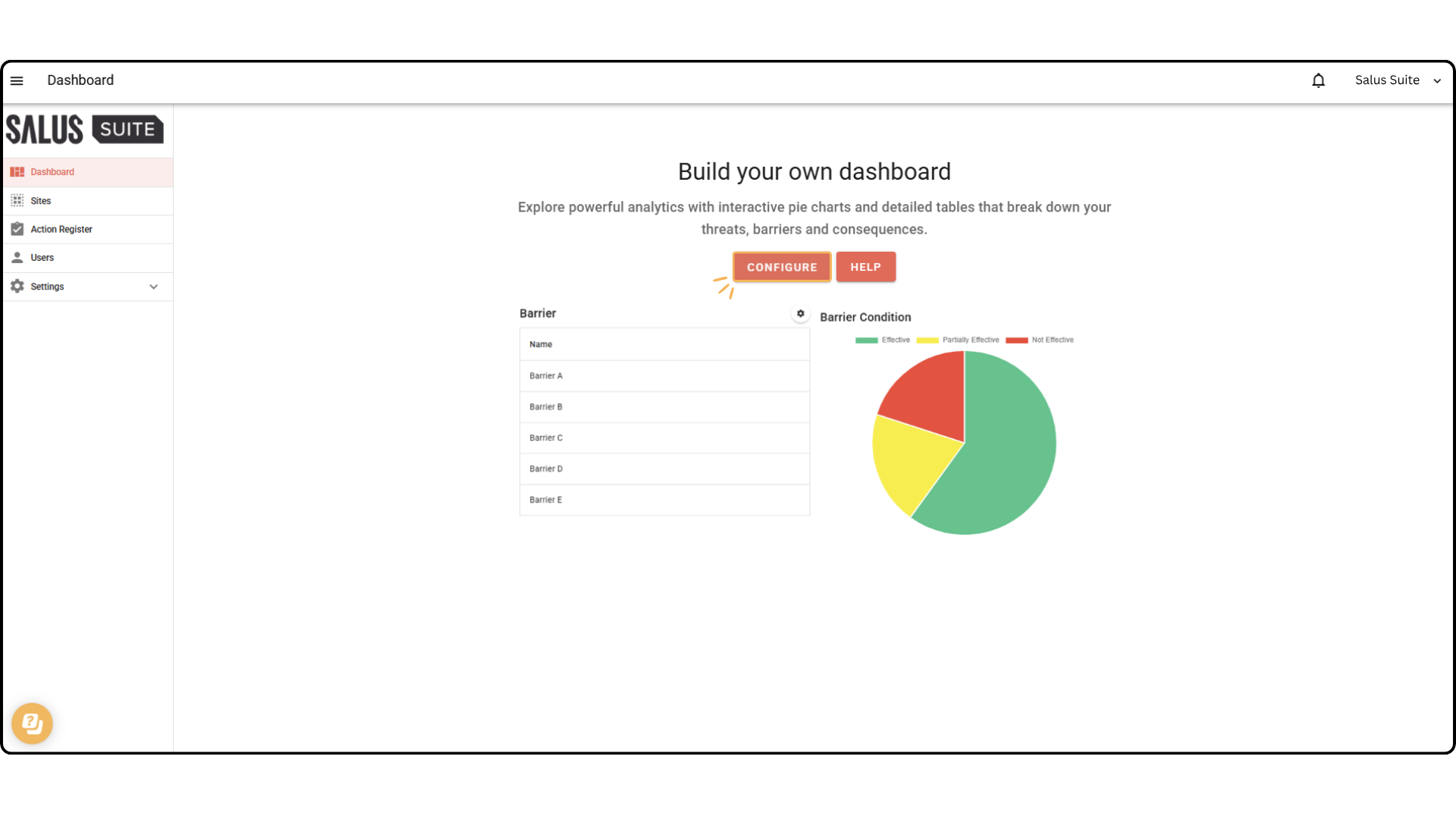
Build Your Own Dashboard
The Salus Suite dashboard allows users to compare data across multiple diagrams and projects. Each user’s dashboard view is unique to their account, customisable through set data options. All elements within the dashboard are drag and drop, meaning users can alter the overall layout.
Step 1: Go to the Dashboard Menu.
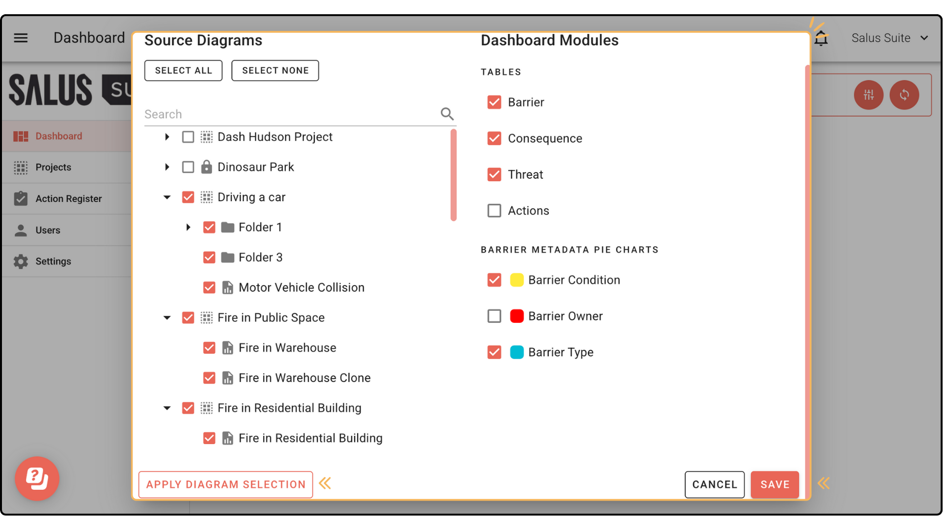
Step 2: Select the Configure button.
Step 3: In the pop-up, select whole projects or individual diagrams to analyse. Click Apply Diagram Selection. Choose which elements you’d like to display in table format. You can also select which types of metadata you would like to see displayed in pie charts. Press Save.
 In your dashboard, you can choose to display metadata and risk matrix within the tables.
To do so, click the gear icon on the top right of each table (Barrier and Consequence), and select the types of metadata and risk matrix setting you want to be visible.


