The 6 elements of bow tie diagrams you need will create a visual diagram of an event, that you want help describing or for risk assessment. The diagram visualises an event with its perceived threats, consequences, and barriers which prevent the event from ever occurring, or minimises its consequences.
Bow tie diagrams are one of many barrier risk models available to assist the identification and management of risk and it is this particular model we have found (and are still finding) useful.
Summary
The bowtie diagram has three main components: the top event, threats and consequences. The top event is the point at which control of the hazard is lost – but nothing bad has happened yet. Threats are the sources of harm, which could lead to the top event. Consequences are the undesirable outcomes of the top event.
Barriers are put in place between the causes and top event, and the consequence and top event. The barriers are the measures that have been taken to address the threats and mitigate the damage caused by the consequences.
Modern Bowtie Software can be used to identify the following:
- The threats posed by the event and their potential consequences.
- The damage that could be caused by the event and how it can be mitigated.
- What preventive or mitigative measures have already been put in place and how they could either prevent or reduce the amount of damage that could occur as a result of the event occurring.
Sign up for a 14-day free trial of Bowtie Master
The 6 Bowtie Diagram Elements You Need
1 – Concise, descriptive Top Event
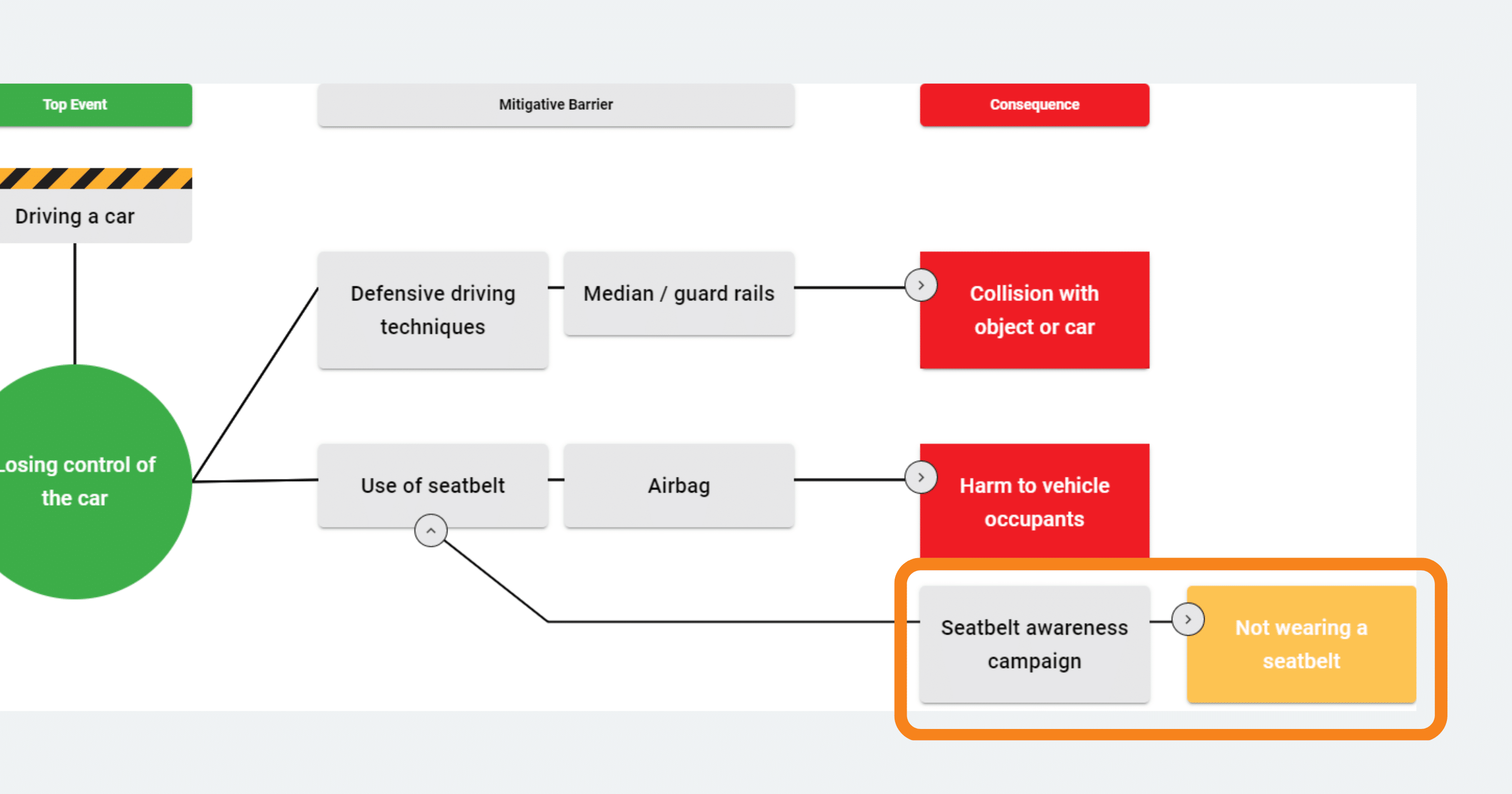
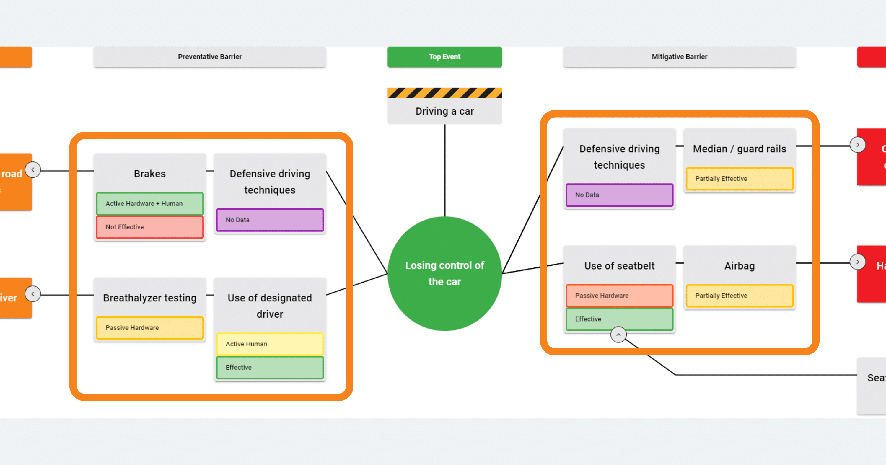
The top event in a bowtie diagram is the event that triggers the analysis. It could be anything from a system crash to an event that has the potential to cause significant damage. For example, losing control of a car whilst driving could be classed as a top event and could have consequences such as injuring or even killing someone.

2. Detailed Causes of the Top Event
The causes in a bowtie diagram are the potential factors that could led to the event. These could be anything from system malfunctions to human error. Once you’ve identified the top event you will then need to identify the factors that contribute to that event taking place. These are placed on the left hand side of the top event and can be referred to as Causes or Threats.
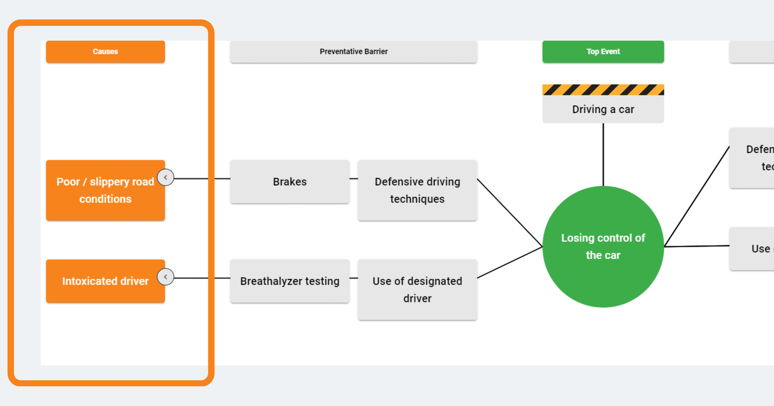
3. Reasonable Consequences of the Top Event
The potential consequences for the top event could include damage to the environment, injuries to staff or customers, loss of business and even loss of life. Once the potential consequences of the top event have been identified you can then assess what the impact will be and how to mitigate the damage by implementing preventative measures. The consequences of the top event are placed on the right hand side of the top event.

4. Barriers to prevent the Top Event or mitigate its Consequences
The barriers in a bowtie diagram are the measures that have been taken to address the causes and mitigate the damage caused by the consequences. This can include installing additional safety measures and training staff in how to handle emergency situations. By understanding the barriers and how they have been implemented you can ensure that any damage caused by a top event is limited.
When it comes to mitigating the damage caused by an event, understanding what factors led up to that event is essential. This will enable you to identify the most appropriate preventative or mitigation measures and implement them effectively.

5. Escalation factors relating to any barriers
Escalation factors should be used sparingly, representing only barrier failure modes presenting a major threat. They represent a situation or condition that lead to a reduced effectiveness of the barrier. In our example, the use of a seat belt is a barrier to harm of the occupants on the vehicle after losing control of the car. If someone in the car isn’t wearing a seatbelt, this is considered an escalation factor as the barrier isn’t effective.
6. Barriers to those escalation factors in place
Barriers to escalation factors work in the same way as barriers to causes and consequences. From our example, a barrier to an escalation factor of not wearing a seatbelt would be a seatbelt campaign by the government, highlighting the risks of not using a seatbelt.
4 Bow tie Diagram Elements Your Boss Will Love You For
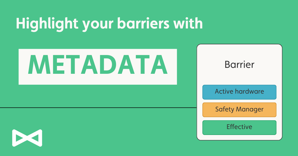
1 – Descriptive Metadata
Metadata gives more information and context to the diagram viewer. Bowtie Master allows you to add customisable data which is relevant to your company or industry. From the example, metadata could include Barrier Type, Barrier Condition and the Performance Standard.
Metadata can be customised to a drop down list or free text. You can add a hyperlink to reference internal documentation or a website to support the type of Metadata chosen.
Add and Edit Metadata to your Bowtie Master Diagram
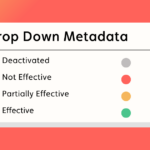
2. Colour-Coded Metadata
By changing the Metadata colour, viewers can easily see how effective the barrier is and what are the possible influences of a cause or consequence are. By colour coding how effective the barrier condition is, it gives a clear indication of where adjustments need to be made
3. Live Share Link
Communicate your risk immediately by sharing a live link to your Bowtie Diagram, without the need to login. This link is automatically updated when any changes are made to the diagram. Making changes? De-activate the link until you have finished your work. We love the share link for SharePoint and Teams.
How to Share a Diagram with Bowtie Master
4. Risk Matrices for consequences
Provide the likelihood of a consequence by using a risk matrix. The risk matrix can be customised with as many x- and y-axis ratings as you need. Show these as an initial or residual risk, and the risk rating can be viewed the same way as Metadata on the diagram element.
Conclusion
Using these 6 bow tie diagram elements, you will be able to visualise and manage risk. Bowtie Diagrams have 3 main elements, the top event, causes and consequences of that event. Barriers are put in place to mitigate the likelihood of the causes or consequences happening. Escalation factors show where a barrier might fail, and the appropriate barrier is put in place to reduce this. Metadata gives a viewer more context and information to the bowtie diagram. Bowtie Master allows you to customise all the elements, metadata and risk matricies to the relevant standard.